Configuring Your Widget
Before you start sending player data, configure how your widget looks in the Developer Portal. This is where you choose layouts for each surface, set up which fields to display, and preview the result.
Creating a Widget Config
Section titled “Creating a Widget Config”Open the Developer Portal and select your application to create your widget config which can be found under Games > Widget in the left sidebar.
How the Editor Works
Section titled “How the Editor Works”The widget editor uses a hierarchy of concepts:
- Surface: a location where game stats are rendered (e.g. the top or bottom of the profile widget, the widget preview in the mini profile popout)
- Layout: the visual template for a surface; each surface has one active layout
- Component: a logical group of fields within a layout (e.g. the six stat slots in the stats grid)
- Field: a single displayed value within a component (e.g. a stat's value, label, or icon)
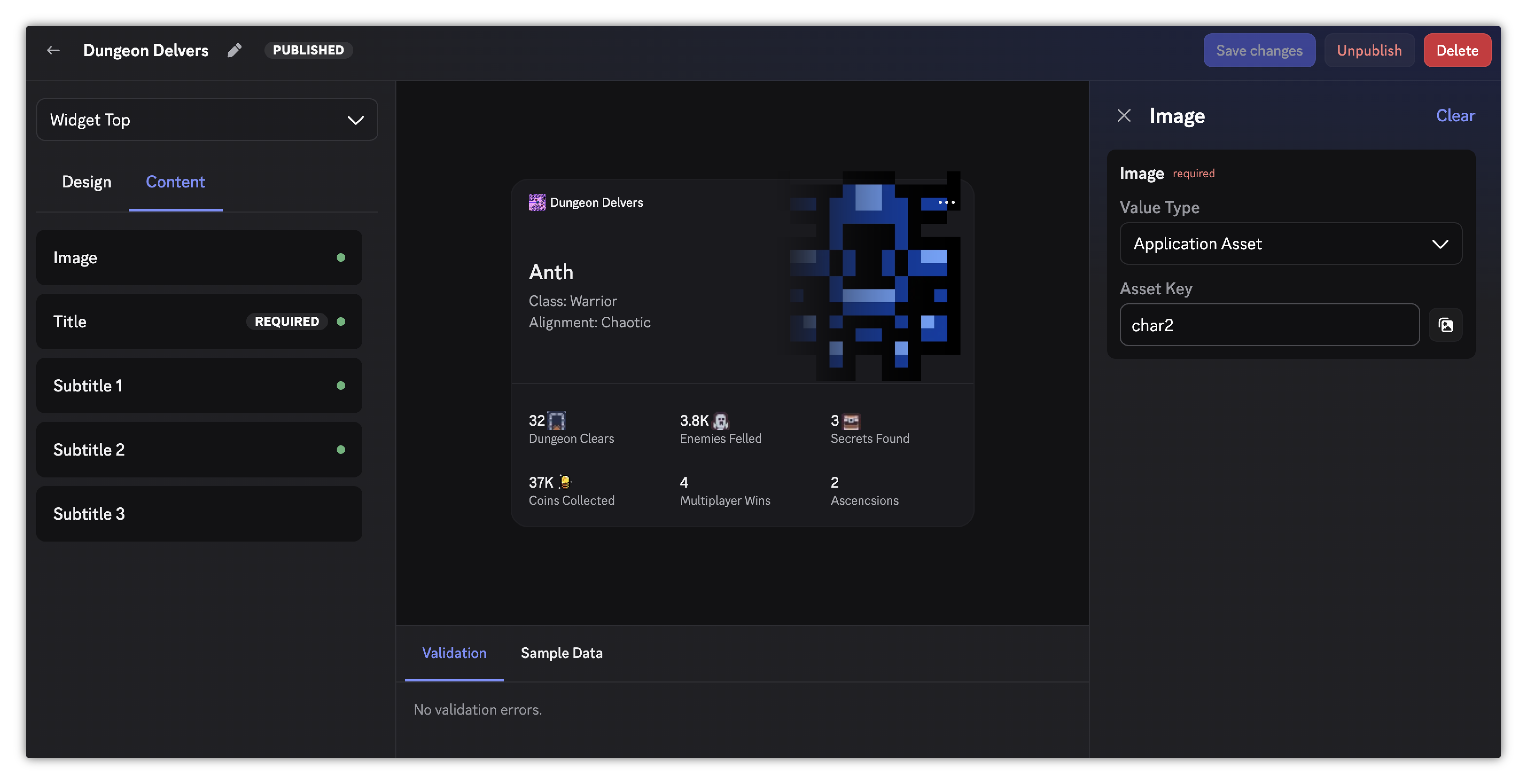
The editor is split into panels:
- Left sidebar: the Design tab selects the layout for the active surface, and the Content tab configures the chosen layout's components. The Content tab appears once you've selected a layout.
- Right sidebar: shows the fields for the component selected in the Content tab.
- Bottom panel: the Validation tab shows any components that need to be completed, and the Sample Data tab provides mock player data to populate the preview.
Use the dropdown at the top of the left sidebar to switch between surfaces.
Surfaces and Layouts
Section titled “Surfaces and Layouts”A widget config has five surfaces, each rendered in a different place in the Discord client:
| Surface | Where it appears |
|---|---|
| Widget Top | The top half of the Game Stats widget on a user's full profile. |
| Widget Bottom | The bottom half of the Game Stats widget on a user's full profile. |
| Add Widget Preview | The preview shown inside the Add Profile Widget modal when a user is browsing widgets to add to their profile. |
| Mini Profile | The widget preview shown in the mini profile popout. Only renders when the user's Game Stats widget is their top widget. |
| Activity Accessory | An accessory shown on activity cards in the mini profile popout while the user is actively playing your game. |
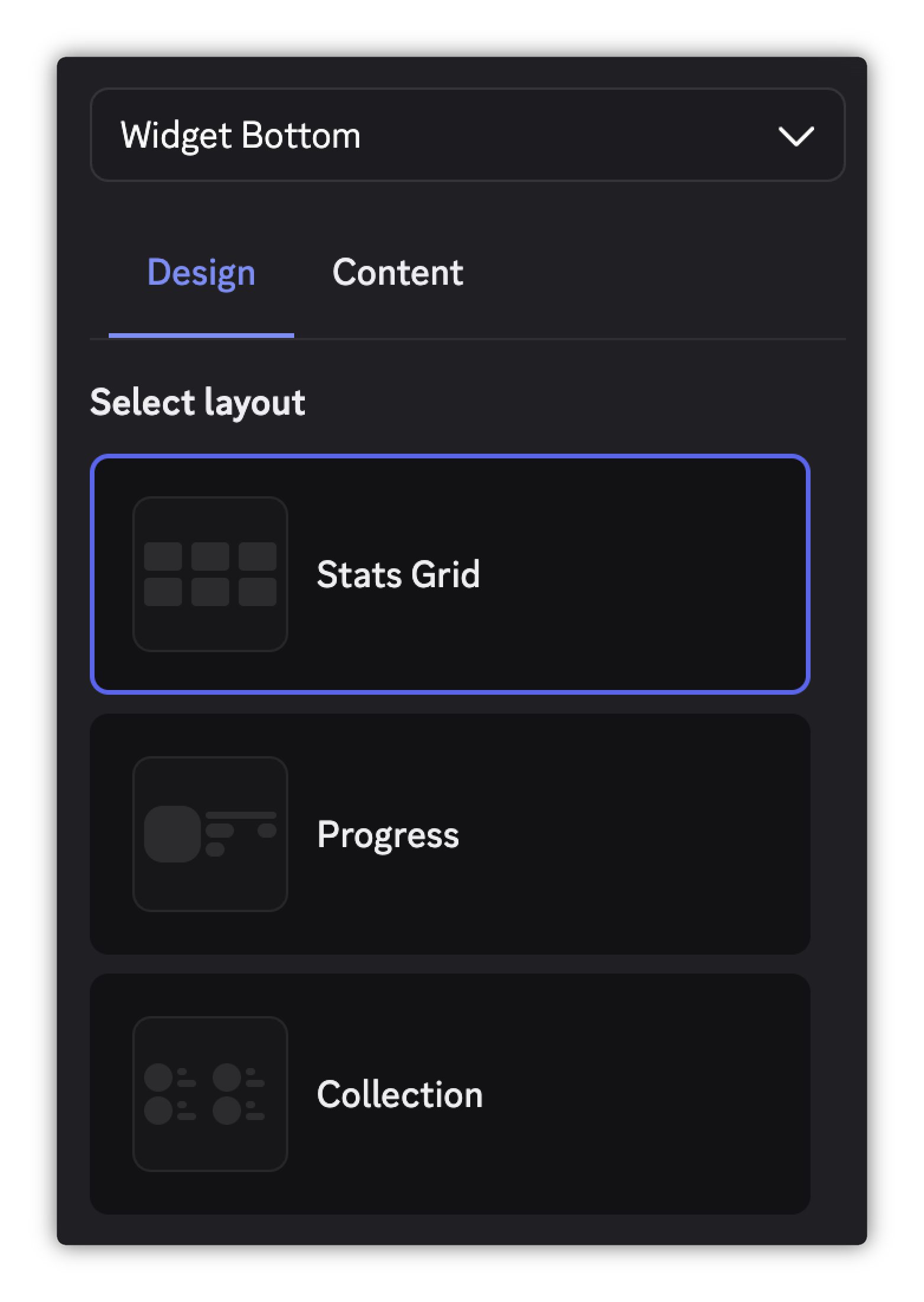
Select each surface from the dropdown and choose a layout in the Design tab. Each layout has a different arrangement of components and fields, so choose the one that best fits the stats you want to show and how you want to show them.
Configuring Components and Fields
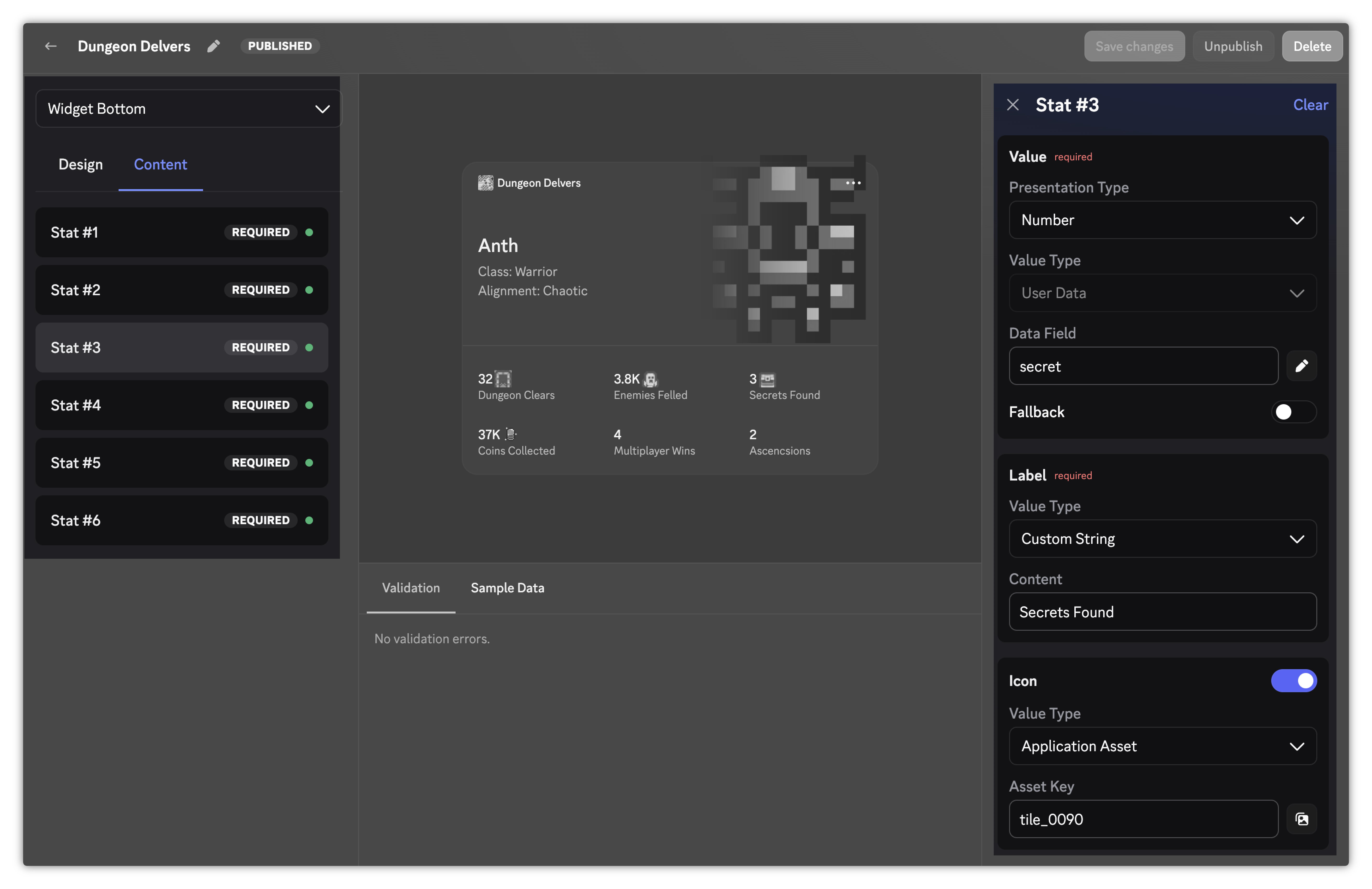
Section titled “Configuring Components and Fields”Switch to the Content tab and click a component in the list to open its fields in the right sidebar.
Field Presentation Types
Section titled “Field Presentation Types”Text-based fields have a Presentation Type that controls how the value is displayed. Each field offers the options that make sense for it (for example, a stat value offers Duration but a subtitle doesn't):
| Presentation Type | Description |
|---|---|
| Number | Displays numeric values with compact notation (e.g. 1500 → 1.5K). |
| Duration | Interprets a numeric value as milliseconds and formats as a duration (e.g. 23400000 → 6h 30m). |
| Text | Displays string values as-is with no special formatting. Number values are not rendered. |
The presentation type you pick determines which value types are available for that field:
- Number and Duration accept User Data only
- Text accepts User Data or Custom String
Image fields don't have a presentation type; whether a field displays an image is determined by the layout. An image field accepts a Value Type of User Data (a media field, such as rank_image) or Application Asset.
Field Value Types
Section titled “Field Value Types”Each field has a Value Type that determines where its content comes from:
| Value Type | Description |
|---|---|
| User Data | Pulls from the player's game data sent via the API. Enter the field name (key) you use when calling the API (e.g. rank_name). |
| Custom String | A static string you set that stays the same for every player. Max 256 characters. |
| Application Asset | A static image you've uploaded to the Developer portal. Enter the asset key. |
Application Assets
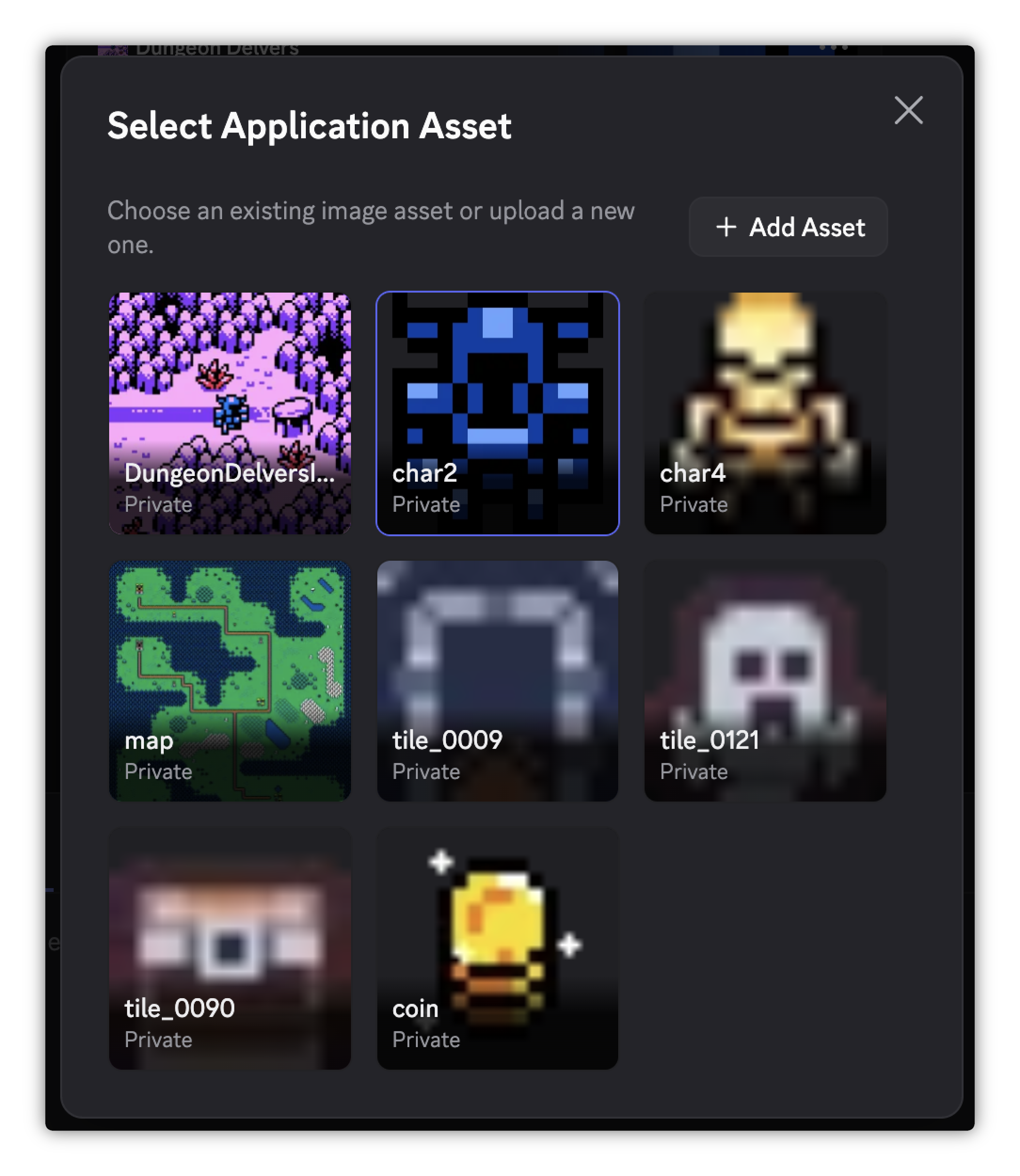
Section titled “Application Assets”Application Assets are static images you upload to the portal. Manage them from the Assets page in the portal sidebar, or use the inline asset picker when configuring an Application Asset field. Check out our comprehensive Image Asset Guidelines that covers best practices for images in the game stats widget with visual examples of how they show up.
Asset keys are validated when the asset is created: max 50 characters, using letters, numbers, underscores, and hyphens.
Common use cases:
- A branded hero image to use as a fallback when a player has no character data
- Static game logo or cover art in the widget top
- A default rank badge for unranked players
- A static image for the Add Widget Preview surface to show in the Add Profile Widget modal
Optional Fields
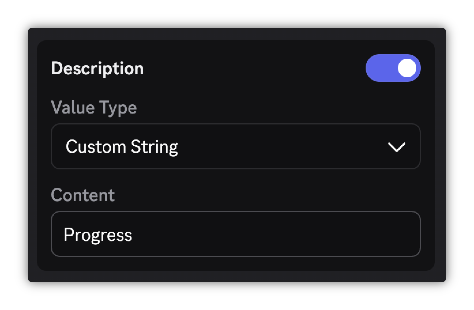
Section titled “Optional Fields”Some fields are optional and have a toggle switch like Description or Max Value. Toggle it on to configure that field or leave it off to omit it from the widget.
Fallbacks for User Data Fields
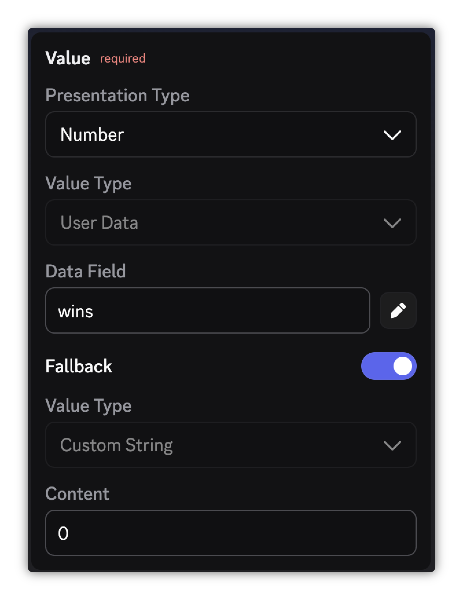
Section titled “Fallbacks for User Data Fields”User Data fields support a Fallback toggle. When enabled, configure a fallback value that renders when the player's data is missing. The fallback can be a Custom String or an Application Asset.
Examples:
- Show
rank_namefrom the player's data. Fall back to the Custom String"Unranked"if it's missing. - Show the player's favorite character image. Fall back to an Application Asset placeholder of a default character if no character has been chosen.
Sample Data
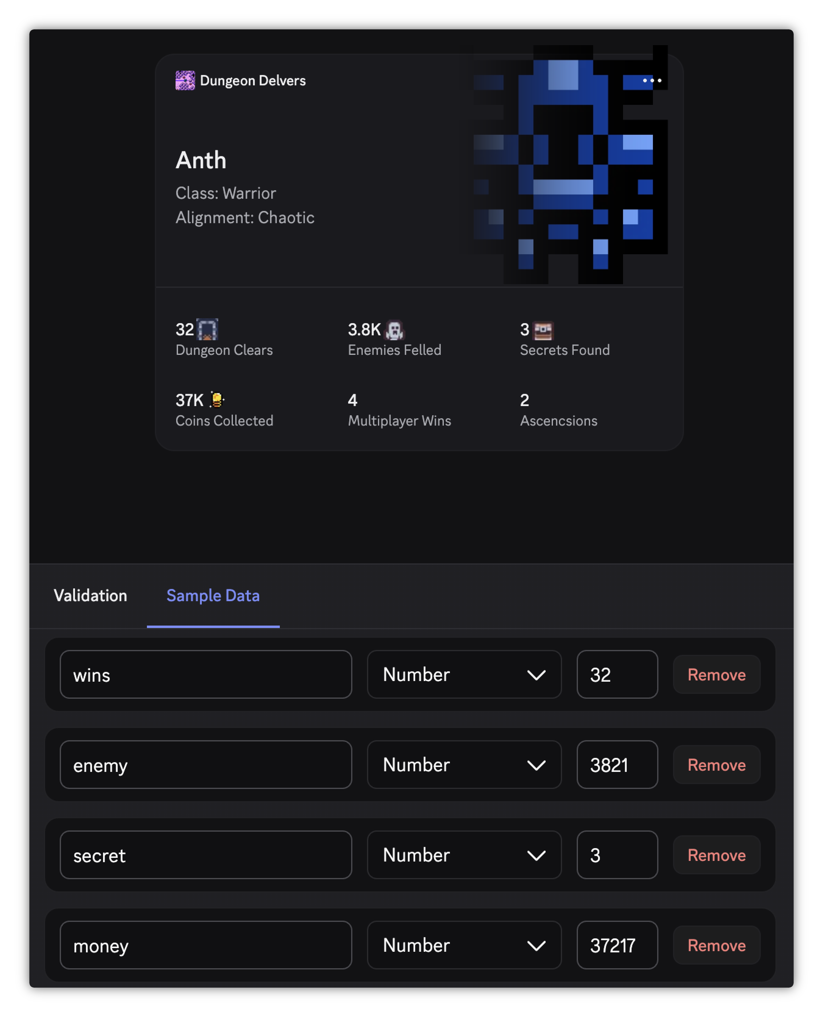
Section titled “Sample Data”The Sample Data tab in the bottom panel lets you provide mock player data to preview your widget without sending real API data.
- Click Add Field and enter a key matching the data field name used in a User Data field config.
- Select the field type (string, number, or media) and enter a sample value.
- The preview updates to show the value wherever that field is referenced.
Testing Your Widget
Section titled “Testing Your Widget”Unpublished widgets can be viewed and added by members of your developer team.
Members of your developer team can test your widget in Discord while it's still a draft.
- Enable Developer Mode in Discord settings (Settings > Advanced > Developer Mode).
- Choose a layout for Widget Top, Widget Bottom, and Add Widget Preview (full field configuration is not required).
- In Discord, open your own full profile and click Add Widget to open the Add Profile Widget modal.
- Under Game Widgets, find your game's widget and click Add to profile.
Publishing Your Widget
Section titled “Publishing Your Widget”Publishing your Game Stats Widget will make the widget discoverable and allows players to add it to their profile after account linking with your game's Discord app.
In order to publish your widget, all three of these surfaces must have a layout chosen and all required fields configured:
- Widget Top
- Widget Bottom
- Add Widget Preview
Once complete, click Publish in the top-right header to make it available to your players.
Next Steps
Section titled “Next Steps”Once your widget is configured, move on to Sending Game Data to start populating it with live player stats.